Table of Contents
When you think of communication, you might first think of phone calls, text messages or two people talking. As you think longer about it, sentence structure and tone of voice might come to mind. Some things said sarcastically can be laughable or amusing, but when said with a serious tone, it’ll give you the creeps.
What you might not think of when evoking communication is a font. Fonts are not so commonly associated with communication, but in fact, can heavily influence our perception of what is being communicated.
With the mobile keyboard being at the forefront of modern communication, we take great responsibility in offering highly usable and legible fonts on Fleksy, while still keeping them fun and pleasing to the eye.
To better understand what it takes to choose fonts and what they imply, we interviewed our Chief Design Officer, Vicky Gerchinhoren.

Can you introduce yourself and share what fonts mean to you?
I have always been in love with letters, I have a background in Graphic Design, so it is kinda natural. I have been studying and practicing calligraphy, which is the art of manually writing beautiful text, for over a decade and I teach Interface Design and the use of text on screens at Elisava, Barcelona´s top Design University. Graphic Design is a different art discipline because it is about communicating something visually — such as a message, that needs to be carried through and conveyed. Whereas illustrations or other types of visual arts are only for the purpose of expressing. Because you cannot accurately communicate everything with images, the text needs to be neatly represented in compositions.
There are different types of letters and the thing with alphabets and scripts is that they carry a lot of meaning in their shapes. The same way you communicate things through styles, textures, colors and everything else, the shape of the text itself has meaning too.
When you think of a brand, which are the fonts that best reflects their personality?
Adidas, because they have this very modular, thick logo that goes along with it and the stripes which are a very simple idea. I think the font there has the same rationale behind it, which is very neat and bold. Adidas is making a statement with very few elements. However, the thing that interests me more is how brands are developing their own typefaces. They’re creating their fonts to fit their brand’s needs.
One of them is Netflix. They decided to create their own font and have it match the cinemascope curve of their logo. It is a distinctive piece of brand DNA ported to the display text. Their new typeface could be used on big screens while also making it legible on smaller displays such as phones. A few other familiar brands with tailored typefaces are Airbnb which developed “Cereal,” Apple with “San Francisco,” IBM with its family of fonts called “Plex”, and Google with its new “GoogleSans” typeface.
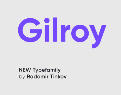
Back onto Fleksy, how did you decide to elect the Gilroy typeface for the brand?
We ended up choosing Gilroy for its nice circular shapes that are friendly and inviting. It has amplitude, it’s very geometric, clear and it doesn’t have any additives. The ligature between the “F” and “L” from “fleksy” was also very pleasing to the eye, adding up to the logo style.
While the font is being used in our logo and communication materials, we only recently added it as a font option for our keyboard. We originally chose to use Roboto for our app settings in order to improve legibility. Roboto has also been proven to be space-efficient, which is important when you’re confined to a screen size of 9:18, and even less as a keyboard.
In general, how do you go about choosing fonts for Fleksy keyboard?
Different fonts connote different tastes and ideas of style. We want to empower our users to freely choose from an array of stylish fonts that are highly legible within a keyboard. Taking these factors into consideration, we have to narrow down our choice to only a few fonts. We also wanted to make sure that we would offer fonts that were not commonly available in other keyboards.
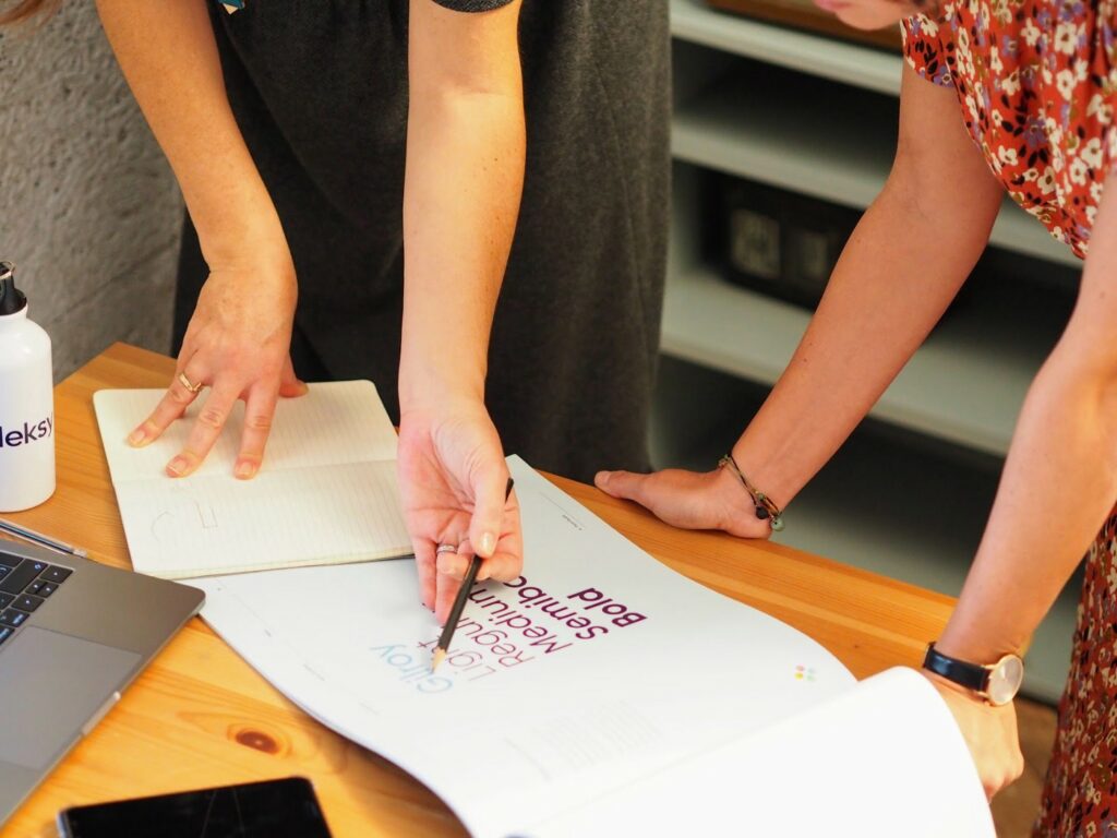
Our users often ask us, why don’t we add more font choices?
We cannot add every single font for a few reasons. One reason is that the fonts have to be embedded in the app. If were to add hundreds of fonts, the app would get way too heavy and slow down the user’s device, even for users who don’t want special fonts.
Another reason is that we risk offering optimal legibility since some fonts vary in size depending on the letter and wouldn’t fit in the designated key space.
Then, we have the functionality of fonts in different languages. Unfortunately, not all phones support the same types of characters, accents, or symbols. This is especially problematic when going between western and eastern languages. There are many symbols in the Chinese language, for instance, that western fonts do not support, and vice-versa. When text is not supported in a particular form by the font you are using, it will appear as an empty box. This is called “tofu” or more commonly seen as: ⃞
This is why it’s important to hand-pick fonts if we want to keep our keyboard functional and beautiful.
This last question might be difficult for you to answer… If you could only use one font for the rest of your life. Which one would it be?
That’s not fair! What I can tell you is that a lot of designers use Helvetica. It’s a very efficient very simple font. It’s legible. Helvetica is really nice and it was properly designed so the proportions are beautiful. For a long time, designers would use Helvetica for everything. While I like it, I don’t agree with this because every typeface communicates something different. You need to find the typeface that tells you the right thing in its shapes not only in what is written.
Try Fleksy today: www.fleksy.com/download-android/